Designers will take a modern twist on the traditional for Spring 2014 by pairing soft pastels with vibrant brights. One the best examples of a blend of pastels and brights is FREESIA. This blazing yellow is sure to illuminate wardrobes as well as interior design in the weeks and months to come. (Sidebar - my mother will be so happy with this choice as she loves all things yellow.)
 |
| The inspiration for Pantone #14-0852 |
Of course, Freesia follows Dazzling Blue as a primary source of color inspiration in the wave of new designs - fashion and interiors alike - having found favor with last Spring's designated yellow choice of Lemon Zest.
 |
| Double Clutch by Stella & Dot |
 |
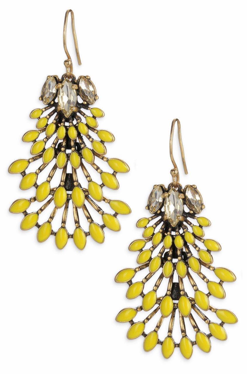
| Norah Chandelier Earrings by Stella & Dot |
Since interiors follow fashion trends, this vivid hue will most likely find its prominence in accents and accessories by adding a welcomed punch of color...
 |
| Pendant by Radiance Lighting |
 |
| Throw from West Elm |
 |
| Hexagon Table from Mod Shop by Room Service |
 |
| Chesterfield Sofa by Anthropologie |
although occasionally being the main attraction...

This makes me (and mom) so happy which always leads to Happy Trend Spotting...
Peace and Blessings,
Tammy
PHOTOS COURTESY OF PANTONE COLOR INSTITUTE, HOUSEBEAUTIFUL.COM, ELEEDECOR.COM, STELLADOT.COM..


.jpg)


