Wednesday, December 4, 2013

PANTONE COLOR REPORT FOR SPRING 2014: FREESIA...

Designers will take a modern twist on the traditional for Spring 2014 by pairing soft pastels with vibrant brights. One the best examples of a blend of pastels and brights is FREESIA. This blazing yellow is sure to illuminate wardrobes as well as interior design in the weeks and months to come. (Sidebar - my mother will be so happy with this choice as she loves all things yellow.) 


The inspiration for Pantone #14-0852
Of course, Freesia follows Dazzling Blue as a primary source of color inspiration in the wave of new designs - fashion and interiors alike - having found favor with last Spring's designated yellow choice of Lemon Zest.


Double Clutch by Stella & Dot 
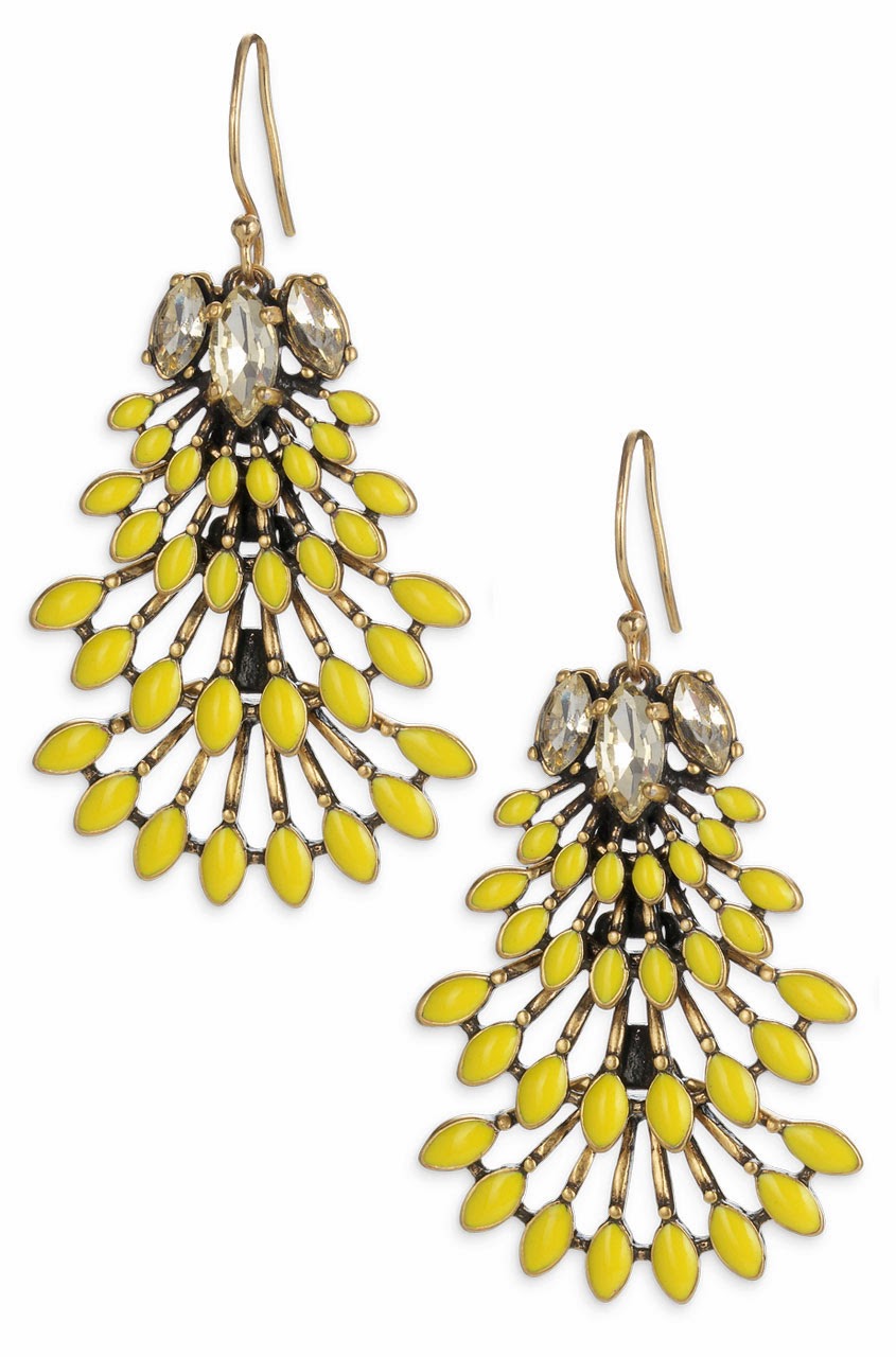
Norah Chandelier Earrings by Stella & Dot
Since interiors follow fashion trends, this vivid hue will most likely find its prominence in accents and accessories by adding a welcomed punch of color...
Pendant by Radiance Lighting
Throw from West Elm
Hexagon Table from Mod Shop by Room Service
Chesterfield Sofa by Anthropologie


although occasionally being the main attraction...


This makes me (and mom) so happy which always leads to Happy Trend Spotting...

Peace and Blessings,
Tammy


PHOTOS COURTESY OF PANTONE COLOR INSTITUTE, HOUSEBEAUTIFUL.COM, ELEEDECOR.COM, STELLADOT.COM..

Wednesday, November 13, 2013

UNIQUE DESIGN DISCOVERIES AT BDNY...

I had the pleasure of attending a fairly new trade show on the scene, the Boutique Design New York (BDNY). Now in its fourth year, BDNY is combined with the International Hotel, Motel & Restaurant Show (IHMRS) making it America's largest trade fair and forum focused on the hospitality industry. 


This trade show presents over 325 exhibitors of furniture, lighting, wall coverings, fabric, seating, accessories, artwork, carpet and flooring, and bath and spa materials. BDNY attracts 5,000+ designers, architects, purchasing executives and developers in addition to hotel owners and operations who also attend IHMRS. This year's BDNY leveraged its growth spurt with two floors of products as well as 10 panel discussions and interactive workshops including the signature Owners' Grill Session. 

This has become one of my favorite trade shows because it features both experiential and practical aspects of hospitality design with some of the most innovative products available. The resources I glean from this show provides unique products and ideas to present to my clients for residential design as well.

Here are some of my notable favorite finds:
Art on Metal by Angela Cameron Fine Art 
Swivel Chair (spins 360 degrees) by Astoria Compass
Astoria Compass
Blue Coast Furniture
Bodie Swivel Chair by Grand Rapids Chair Company
Seating (4 chairs make a circular banquette) by Charter Furniture
Custom Resin Vanity by Neo Metro
Mandy Li Furniture
Custom Wall Installation by Lusive Designs
Mitchell Gold + Bob Williams
Dresser by Koket
Faucets by Vola for Hastings Tile & Bath
Real Cork Upholstery by Wolf Gordon 
Astoria Compass
Mitchell Gold + Bob Williams
Until the next BDNY, happy trend spotting...


Peace and Blessings,
Tammy


PHOTOS COURTESY OF TAMMY BOLDEN.

Tuesday, November 5, 2013

PANTONE COLOR REPORT FOR SPRING 2014: TOP CHOICE - DAZZLING BLUE...

Good-bye Emerald, the color of the year for 2013, and say Hello to DAZZLING BLUE - the top choice of the Pantone Color Report for Spring 2014!!
DAZZLING BLUE #18-3949
Every season the experts at the Pantone Color Institute decide on the top colors in fashion, interior design, graphic design and advertising. This Spring's crop of colors are notably more muted in hue, almost pastel in fact except for the vibrancy of Dazzling Blue aka Cobalt aka Royal Blue... 
PANTONE COLOR REPORT FOR SPRING 2014
Although #18-3949 is the "leader of the pack" color for next year, chances are the color looks somewhat familiar. Mark Zuckerberg, being the visionary that he is, selected this hue for Facebook - mainly because he is red-green colorblind. And of course, he rebranded it Social Butterfly Blue...

Dazzling Blue is also the color seen all over NYC as the hue for the Citibank Bike Sharing Program.

During the last century, artists such as Henri Matisse and Pablo Picasso delved into the hardy hue in their work through entirely different expressions of mood.
The Dance (1910) - Henri Matisse
The Old Guitarist (1903) - Pablo Picasso
Although classic blue sometimes evokes a traditional feel,  Dazzling Blue provides an updated flair to today's fashion...
STELLA & DOT
BURBERRY PRORSUM
KATE MIDDLETON'S DRESS BY ISSA OF LONDON
FASHION ILLUSTRATION FOR YVES ST. LAURENT
GUISEPPE ZANOTTI
STELLA & DOT
and interior design...


So get a little blue and be on trend. Speaking of which - happy trend spotting...


Peace and Blessings,
Tammy


SOME PHOTOS COURTESY OF PANTONE COLOR INSTITUTE, HOUSEBEAUTIFUL.COM, ELLEDECOR.COM..